Accepted here. ⓘ
SHIPPING $10 OR FREE WITH $100 SPEND
September 14, 2022 4 min read
Colour theory is an exciting concept. It's used in many areas of our life, from decorating our homes to masterful artwork in museums, and everywhere in between. Playing with colours shows us all the crazy combinations that occur when we place, overlay or mix all kinds of hues and tones.
Understanding colour theory can enhance one’s eye for art and design — plus, it’s a fun skill to explore further. In this blog post, we dive into some of the colour theory basics, suitable for teaching to your little ones as they play with art and colouring. We also share a fun infographic that you're welcome to download, print or share. Let's get started...
Color theory is like a special set of rules that helps us understand how colours work together. You know how there are different colors like red, blue, and yellow? Well, colour theory helps us figure out which colours look good when we put them together. It's kind of like a magic guidebook for making stunning pictures and paintings! By using colour theory, we can create all sorts of moods and feelings with colours.
Lets look at how to teach colour theory in a fun way. First, gather a bunch of colourful objects like toys, fruits, or even paint swatches. Show them to your children or students and talk about the different colours you see. Next, play some games with colours. Try a scavenger hunt where everyone looks for items of a specific color. Or have fun mixing paint (starting with Red, Yellow and Blue) to create new hues. It's like a colourful science experiment! Finally, encourage creativity by letting kids create their own artwork using the colours they've learned about. Remember, teaching colour theory is all about having fun and exploring the amazing world of colors.
Scroll down for our free printable poster that makes teaching colour theory fun!
The basis of colour theory comes down to three important colours, known as the primary colours: Red, Yellow, and Blue. These are three colours that cannot be created by mixing other colours. When you mix these primary colours together, they create secondary colours.
By mixing primary colours together, you create new colours: Orange, Purple and Green. The exact tone or hue of each secondary colour varies according to the amounts of primary colours used; this means one purple can look different to the next purple. Secondary colours work like this:
Of course, not all shades of red are the same, nor all shades of orange, purple, green, and so on. One way to manipulate the colours you create is to add white or black to each shade, increasing or decreasing its brightness, respectively.
This colour theory technique may not work in practice for all mediums — for example, layering black marker over yellow marker may not have a mixing effect, whereas combining two colours of paint and stirring will demonstrate how this works.
Another important principle of colour theory is warm and cool tones. All colours can be broken down into either warm or cool, based on its strongest hue:
This concept can become further complicated when comparing certain shades. For example, the colour red can be either ‘warm red’ or ‘cool red’, depending on whether it contains more orange (warm) or more blue (cool).
The concept of warm and cool tones is something that many artists, designers and colour theorists study to understand and utilise in their work. These concepts are used across fashion, makeup, interior design, art, architecture, and so much more.
Complementary colours are two colours that lie directly across from each other on a colour wheel. They are opposite hues, containing one warm colour and one cool colour. The basic complementary colours are:
Beyond this, the colour wheel can be divided an infinite number of times to capture all gradients between the basic hues.
Complementary colours look beautiful when paired together, due to the natural illusion that occurs where each colour appears brighter and grabs your attention.
To help you on your colourful journey, we've put together this handy infographic. Feel free to download it and share within your community (please credit @littlechangecreators if you do!).
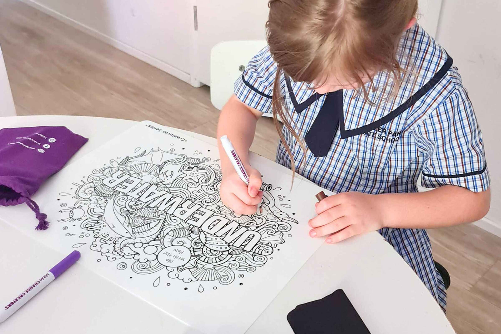
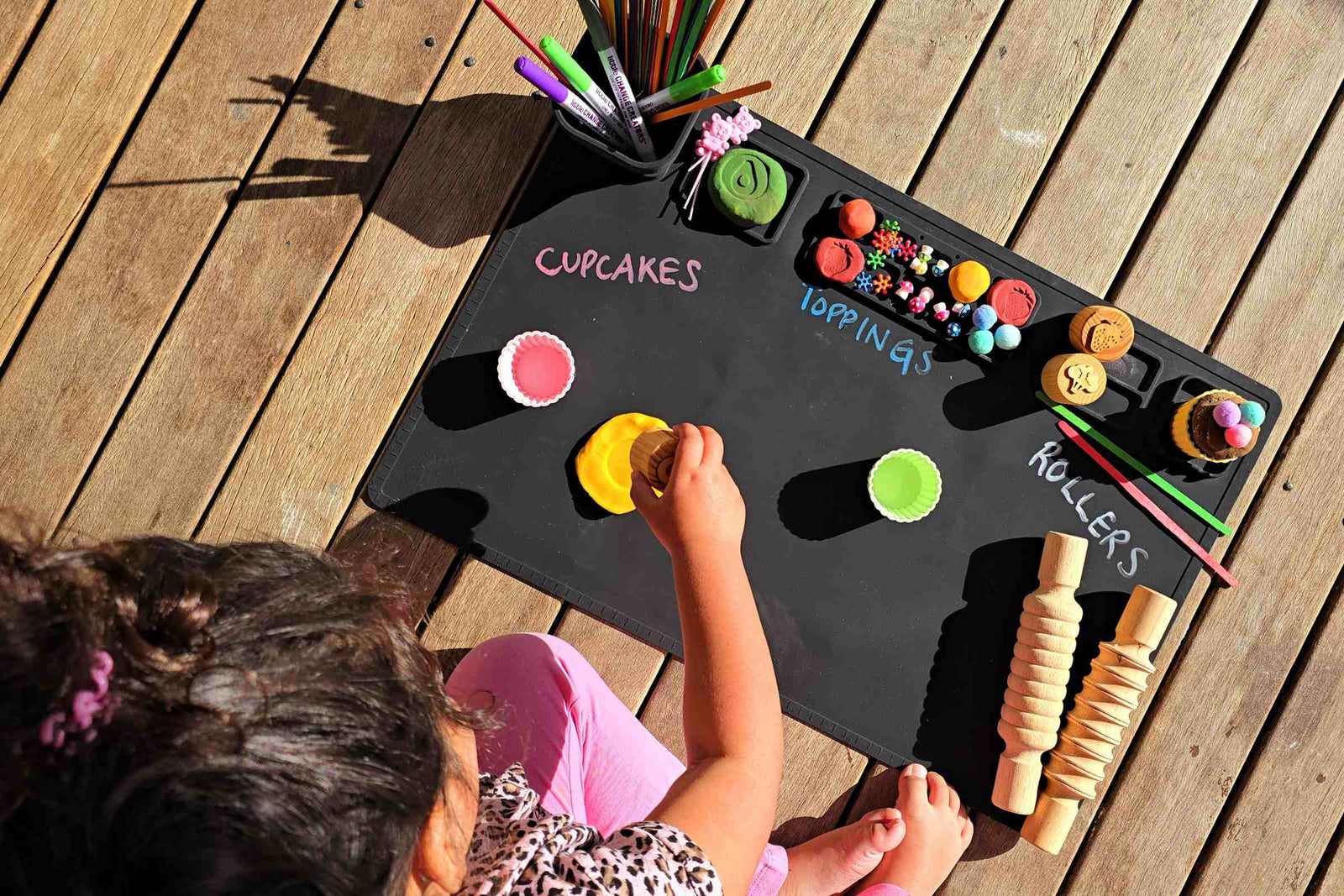
As you play with your Re-FUN-able™ Kids Colouring Sets, which colours will you notice? Do you see how pairing complementary blue and orange makes both colours pop? Can you create your own colour gradient from left to right? The possibilities are endless — and infinitely enhanced with a fun bit of colour theory knowledge.
If you're keen to learn more about the basics of colour theory or would like some materials to share with your children, try these excellent resources:
Colour Theory For Noobs explains all aspects of colour theory in an engaging video that's suitable for kids.
Canva's Colour Wheel allows you to experiment with colour combinations and palettes.
My daughter loves them